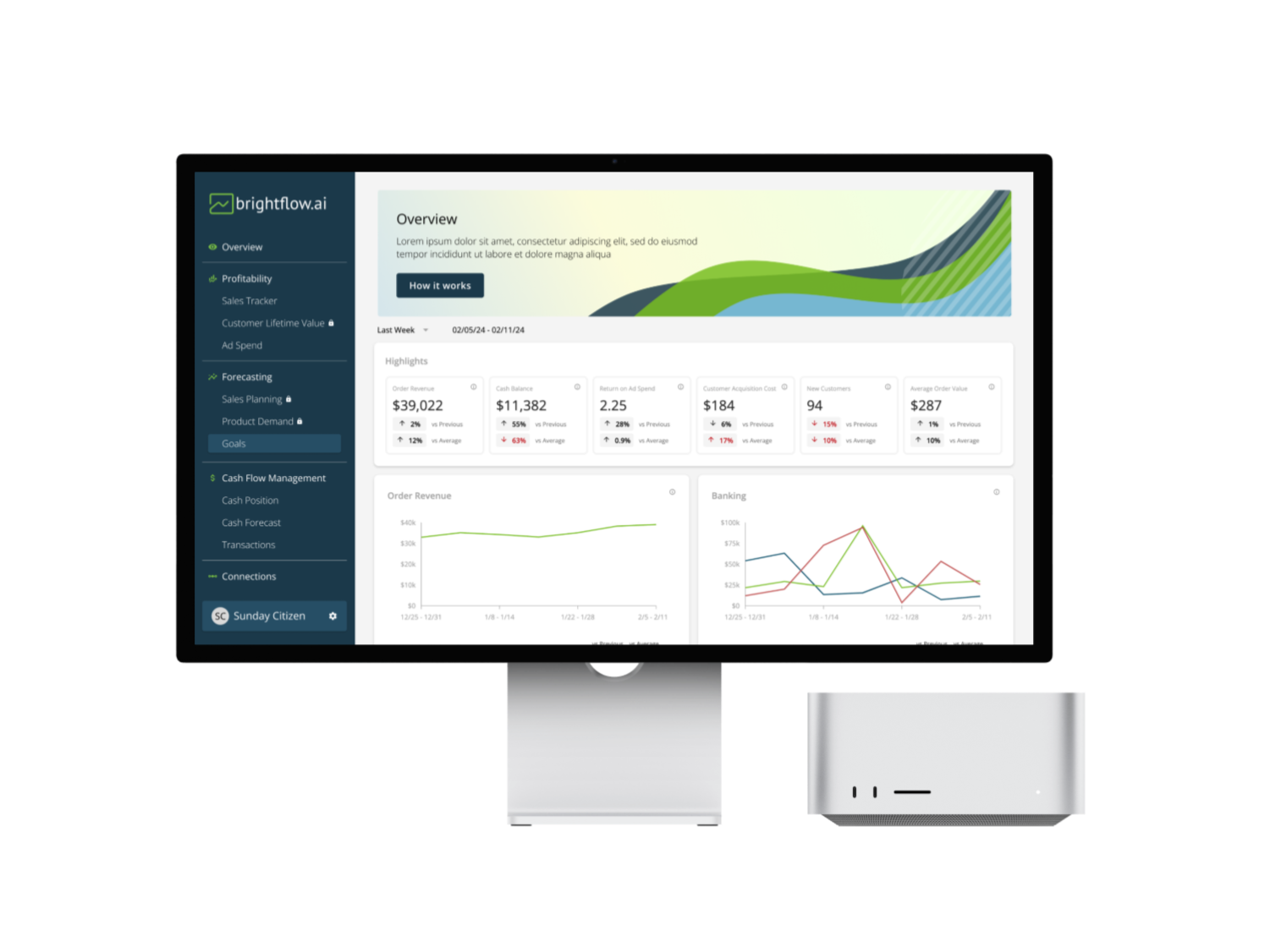
Brightflow AI Platform Refresh
Providing businesses with a clear, intuitive tool that allows them to assess their financial health at a glance.
Role
Senior Product Designer
Skills
UX Research, UX/UI Design, Prototyping, Testing, Project Management
Timeline
January 2024
Background
Brightflow AI is the sales data and intelligence platform empowering small and medium-sized businesses to take control of their cash flow. Learn more about what Brightflow AI does.
Project Overview
The Brightflow AI Platform Refresh project focuses on redesigning the user interface and improving the information architecture. The goal was to create a more intuitive and visually engaging experience, allowing businesses to quickly understand their financial health at a glance. By streamlining the presentation of key metrics and insights, this update would empower users to make more informed decisions with greater ease and efficiency.
Existing State
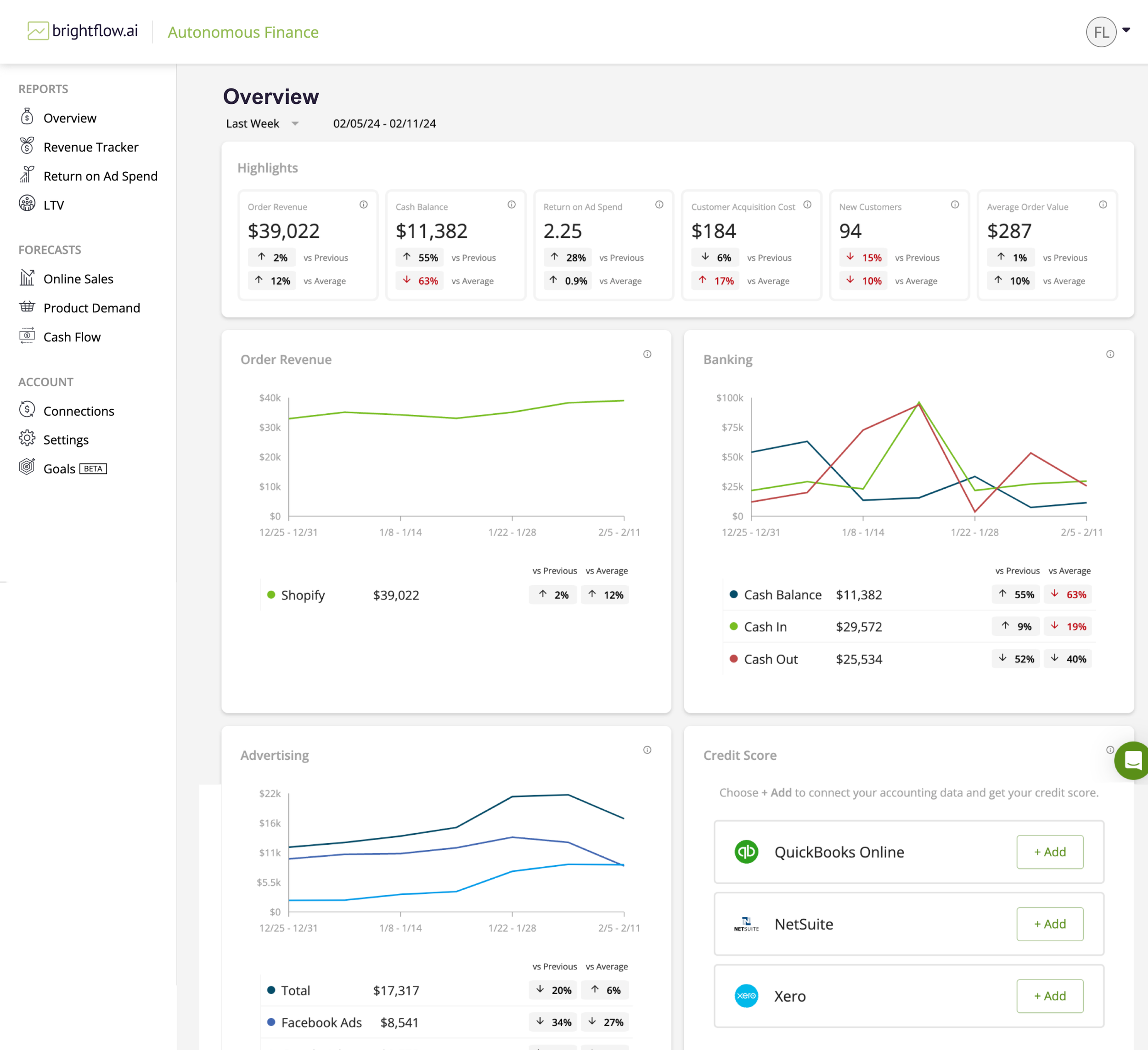
My first official task as a Product Designer at Brightflow AI was to refresh and enhance the platform’s overall look and feel. Given the amount of screens involved, we decided to break down the project into manageable phases. This first phase focused on updating the UI to align with the new brand design and restructuring the sidebar menu’s information architecture to ensure consistency across all pages on the platform.
Recommendations
After speaking to users about their needs and observing how they used the existing state of the platform, I recommended focusing on the following areas.
UI Alignment with Brand
Ensure that all visual elements, such as colors, typography, iconography, and layout styles, align with the updated brand identity. This will help create a cohesive experience and reinforce the brand's visual language throughout the platform.
Usability & Intuitiveness
Ensure that the design is easy to navigate and requires minimal effort from users to find and understand the information they seek.
Information Architecture
Restructure the sidebar to create a logical, easy-to-navigate menu that improves discoverability. Ensure that essential features are prioritized and organized intuitively for users, with consistent labeling and hierarchy across all pages.
Responsiveness & Scalability
Design with scalability in mind so that the interface adapts well to different screen sizes and can incorporate future features without compromising usability.
The Final Design
UI Alignment with Brand
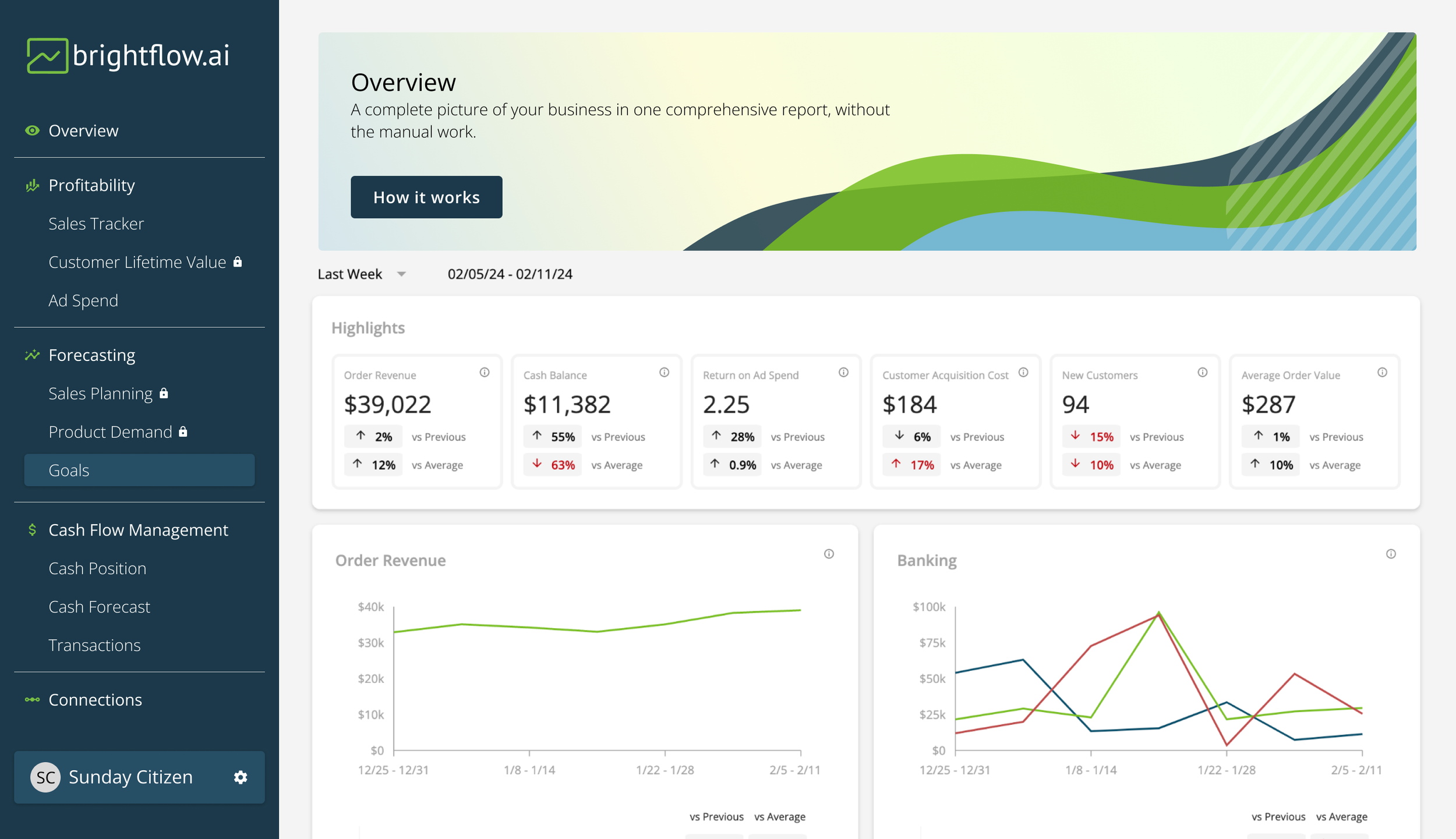
Inclusion of new brand colors to bring the platform to life and offer visual distinction between the different sections.
Updated typography and consistency of typography system (H1 vs P1)
Usability & Intuitiveness
Icons to provide quick visual cues of the feature categories and break up text.
Collapsed Settings & Accounts options in one place (bottom left vs top right) for ease of access.
Introduction of simple interaction designs (highlight of selected screen in menu)
Information Architecture
Category names now reflective of the type of tools available within the platform
Header sections to describe the purpose of each screen accompanied by an explainer video (“How it works” CTA)
Responsiveness & Scalability
New tablet and mobile friendly screens with parity in available information
Updated backend architecture allows developers easier foundation to build new features upon


